



Design Challenge
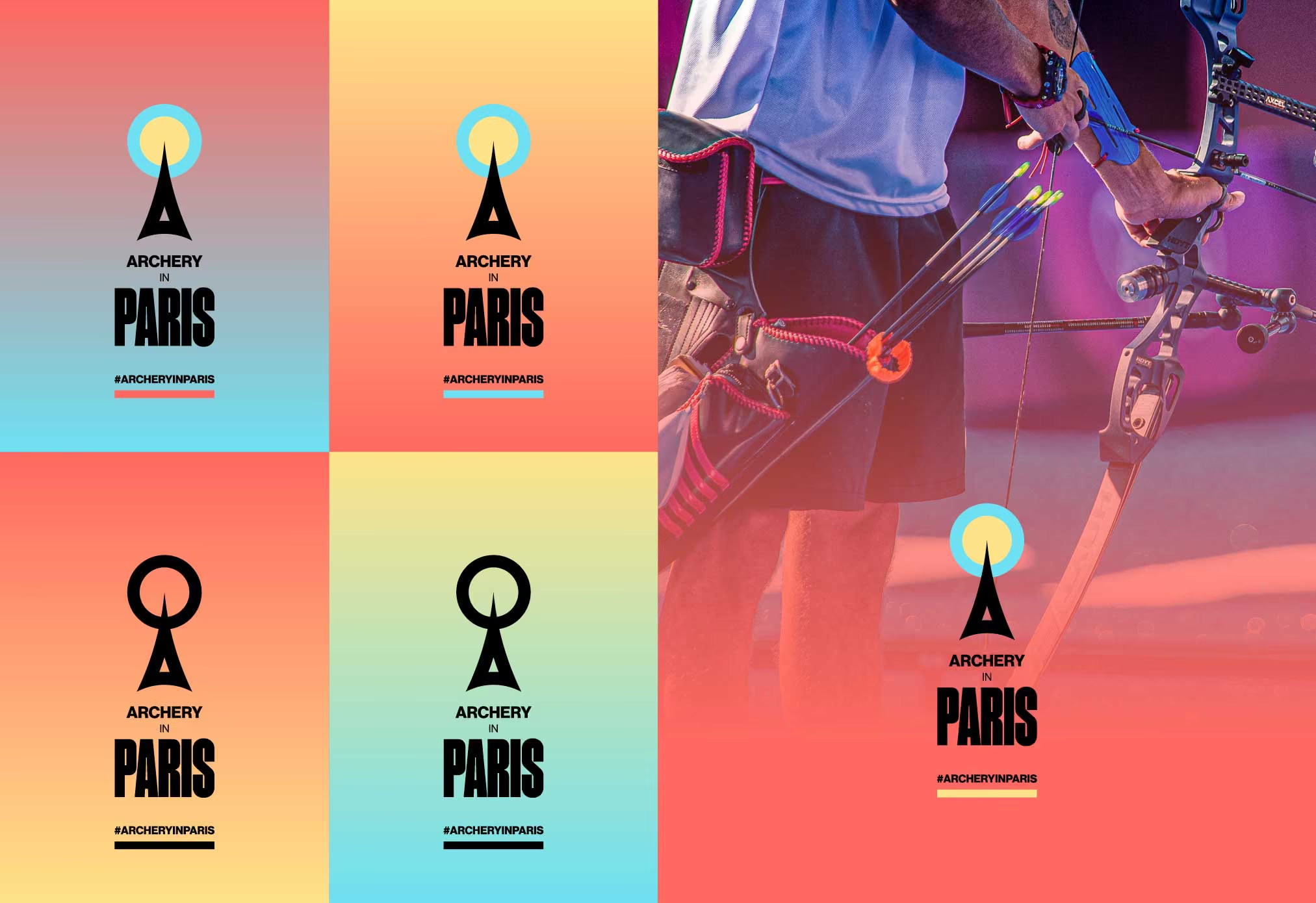
Branding already existed for the Paris Olympics but the icon for archery was deemed to be not particularly accurate. What was needed was something to sit along side the Paris Olympics branding for World Archery's social and online coverage.

Creative thinking
A logo was created to tell a story; archery (target) and an arrow (the Eiffel Tower) which also represents a sunny day in Paris. This was then combined with a pastel colour palette to complement the brand colours of the games itself and rolled out on posters, socials and web.