World Archery Awards
Branding and motion design for sports awards
World Archery Federation are the IOC approved body for archery and archers. They organise and run events around the world as well as providing community and even have a channel, archery+, with multiple brands under their banner. They came to me to develop a brand for their annual awards having provided several successful brands for them before.
Design Challenge
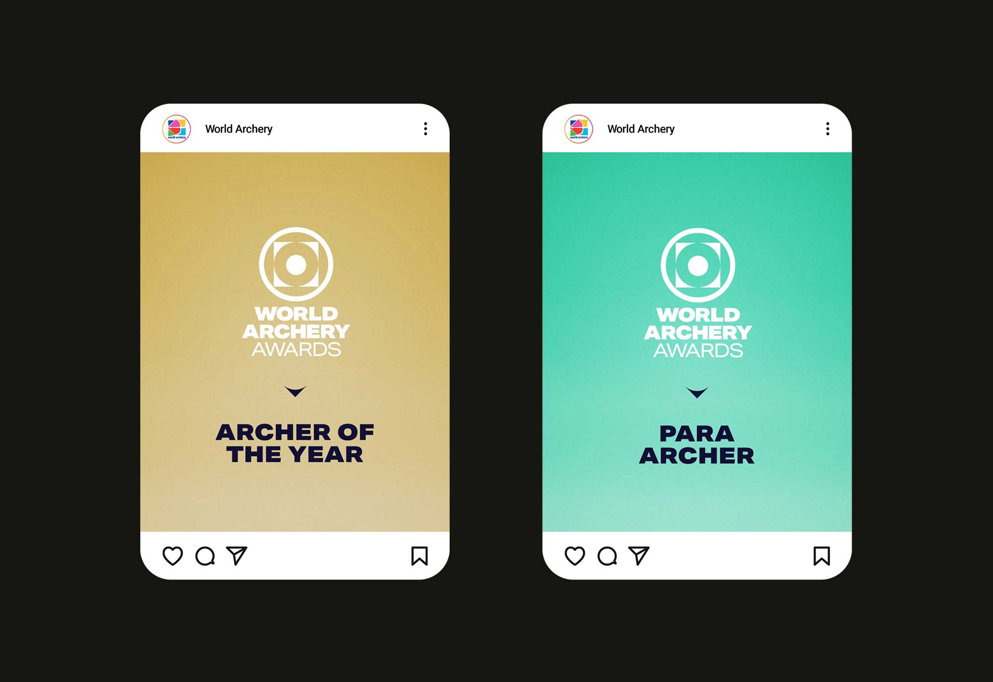
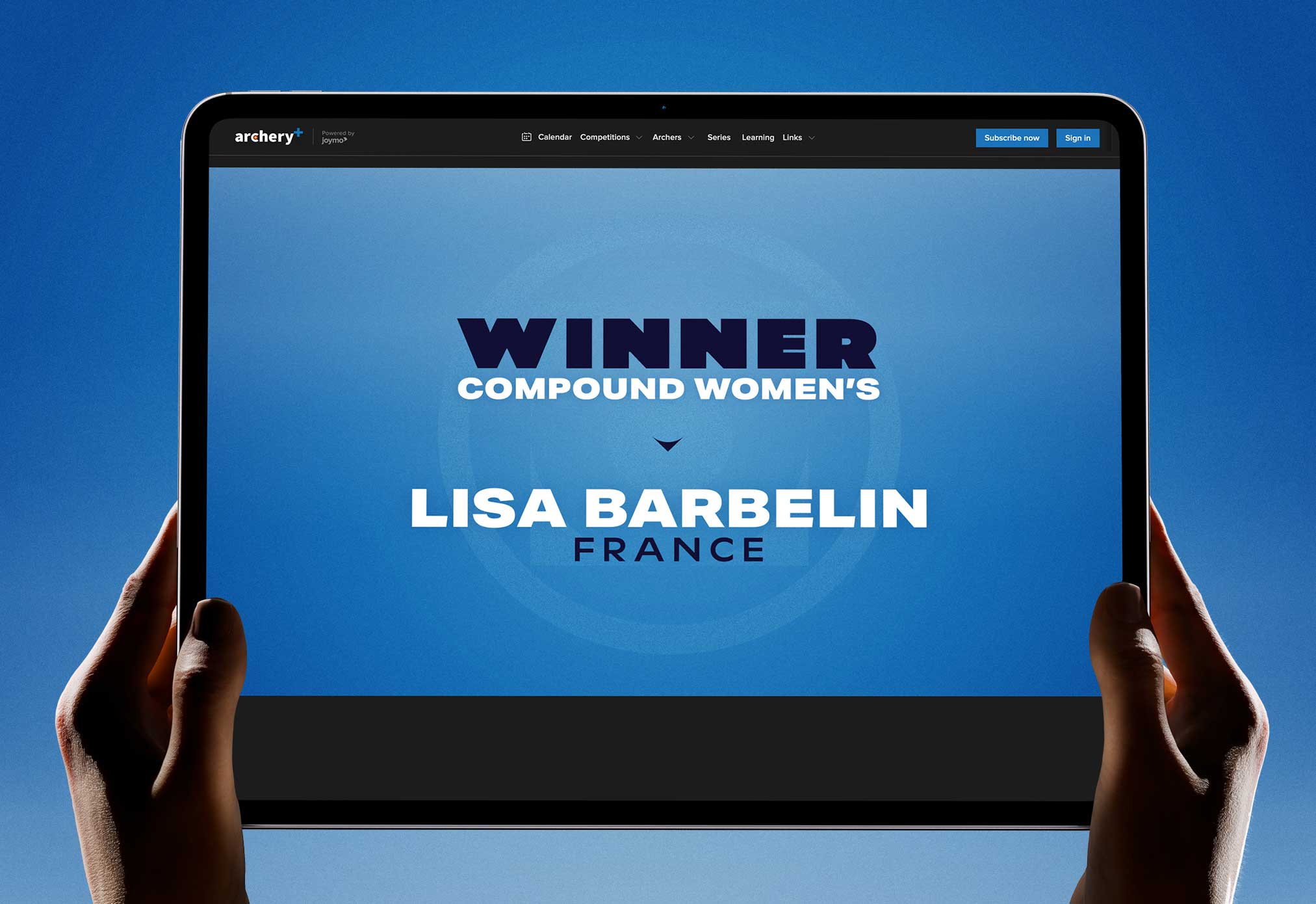
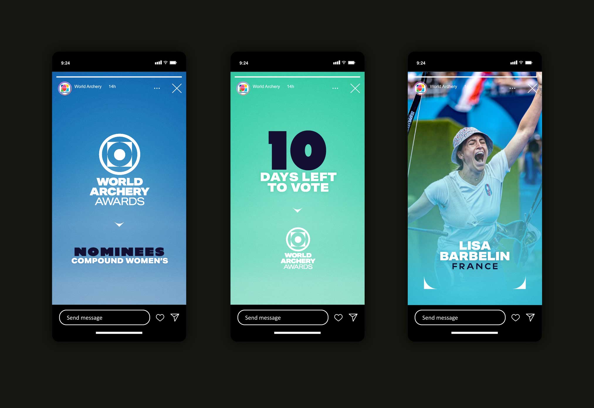
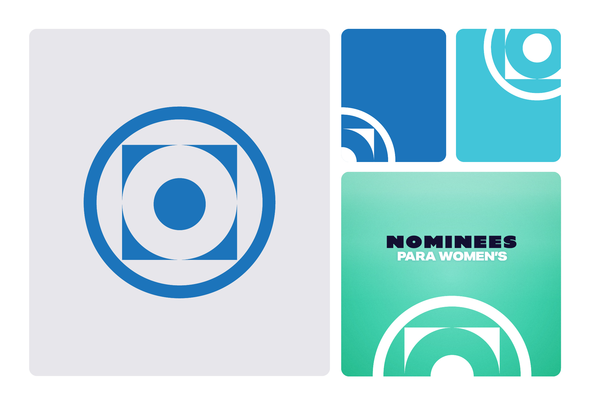
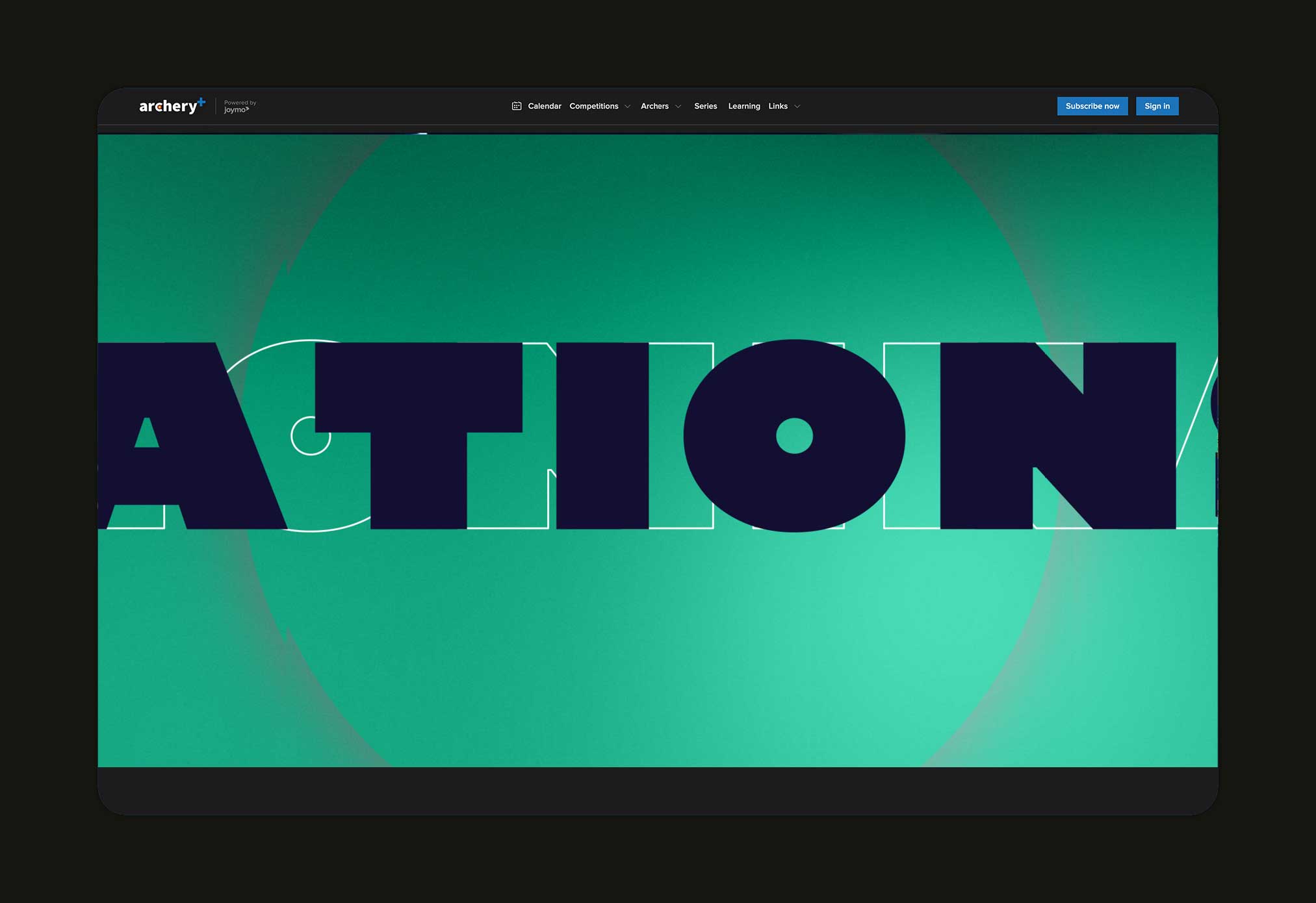
A logo already existed but it was average and the rest of the brand was non-existent. My task was to create a new logo and provide a complete brand to guide the team across its many uses. The main use for the brand would be its application in motion for the awards event on the archery+ TV channel. A logo that would work well in motion was therefore important and needed to be combined with typography that was easily readable.
Creative thinking
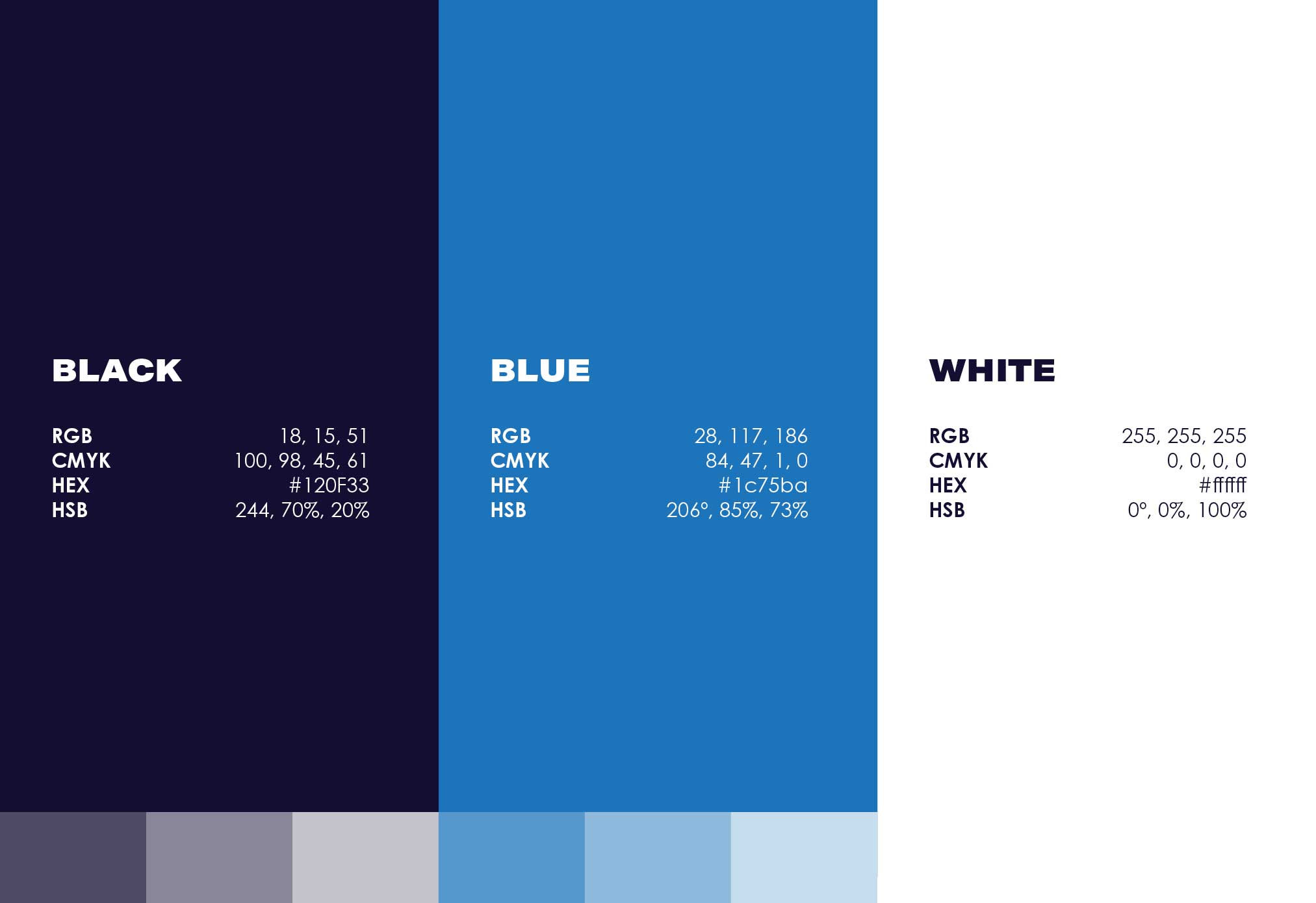
Clarity and responsivity were central ideas throughout the design process, ensuring the brand communicated seamlessly across print, on socials and on video. A strong influence was drawn from the world of archery, specifically the target. This reference was combined with clean, geometric Swiss shapes, creating a stylised target. A strong, clear typeface was chosen for headings, one that complimented the curves of the logo. Graphical elements were crafted directly from the logo to ensure balance and harmony.