Youyi Sports
Rebrand for a Chinese sports equipment supplier
Youyi are a leading brand in archery equipment having supplied many events and tournaments, including the Olympics, for two decades. CEO Liu Yongkang came to me to help reinvent their branding which was inconsistent and in need of an update.



Design Challenge
Several logos were already in existence. There were no brand guidelines and a wide variety of styles across web, print and on products were in use. There was no uniformity and no brand to speak of. Defining a style and the brand's voice was key. This lack of brand and disjointed feel across all media and products left a unprofessional impression. A brand that echoed the company's history as a leader in the sport but looked towards the future was needed.

Creative thinking
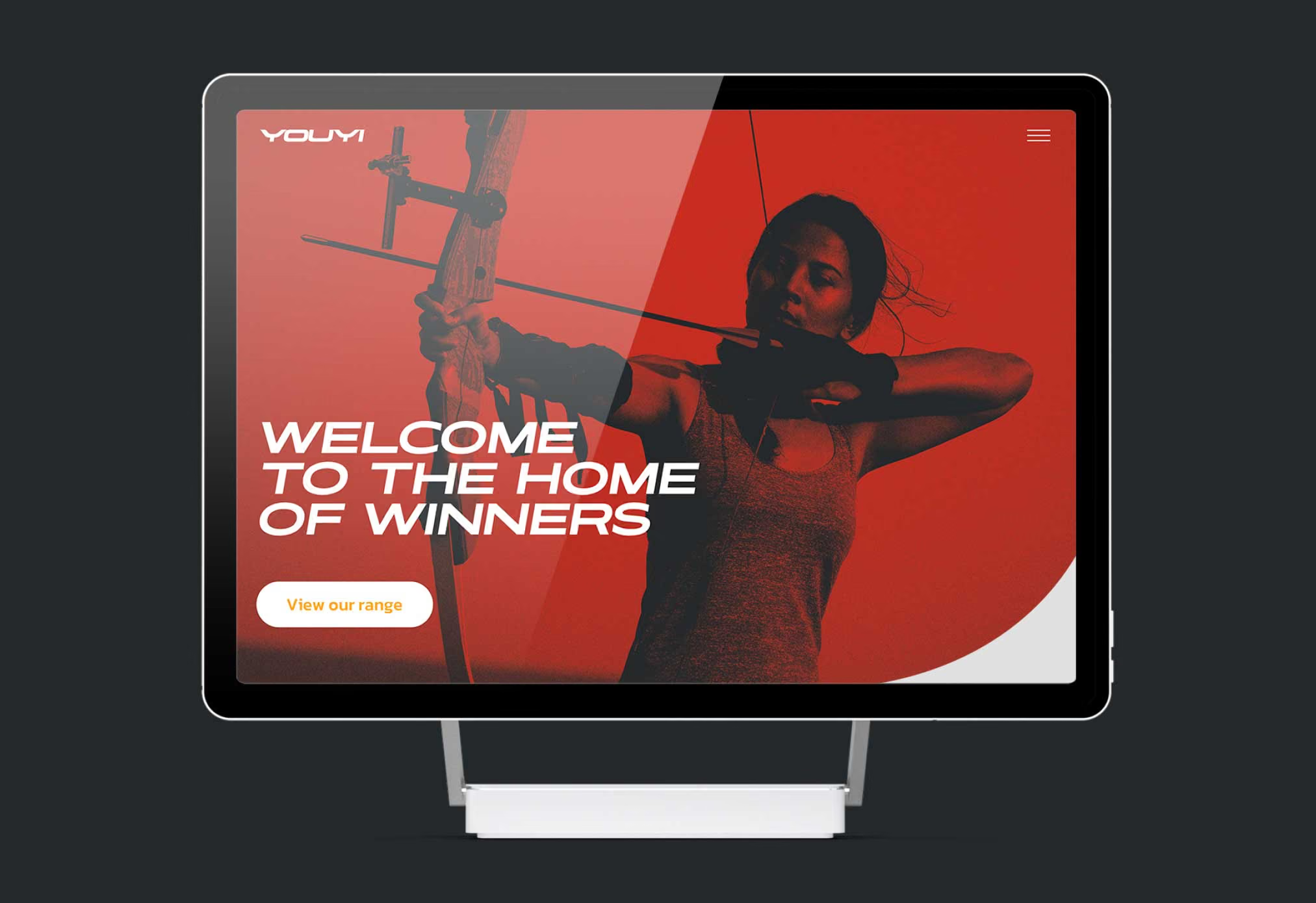
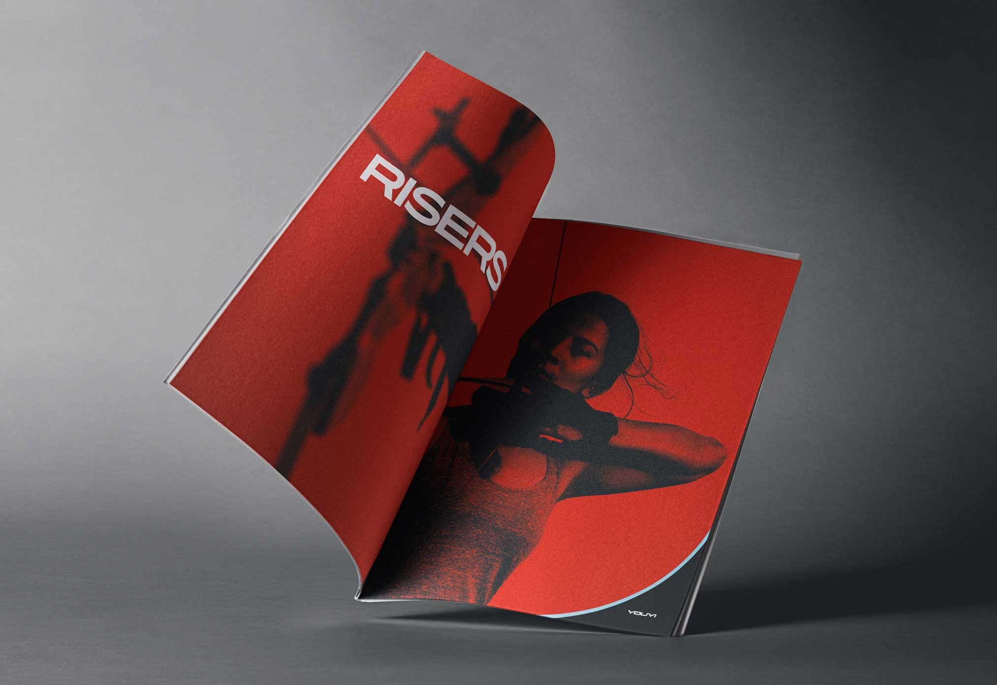
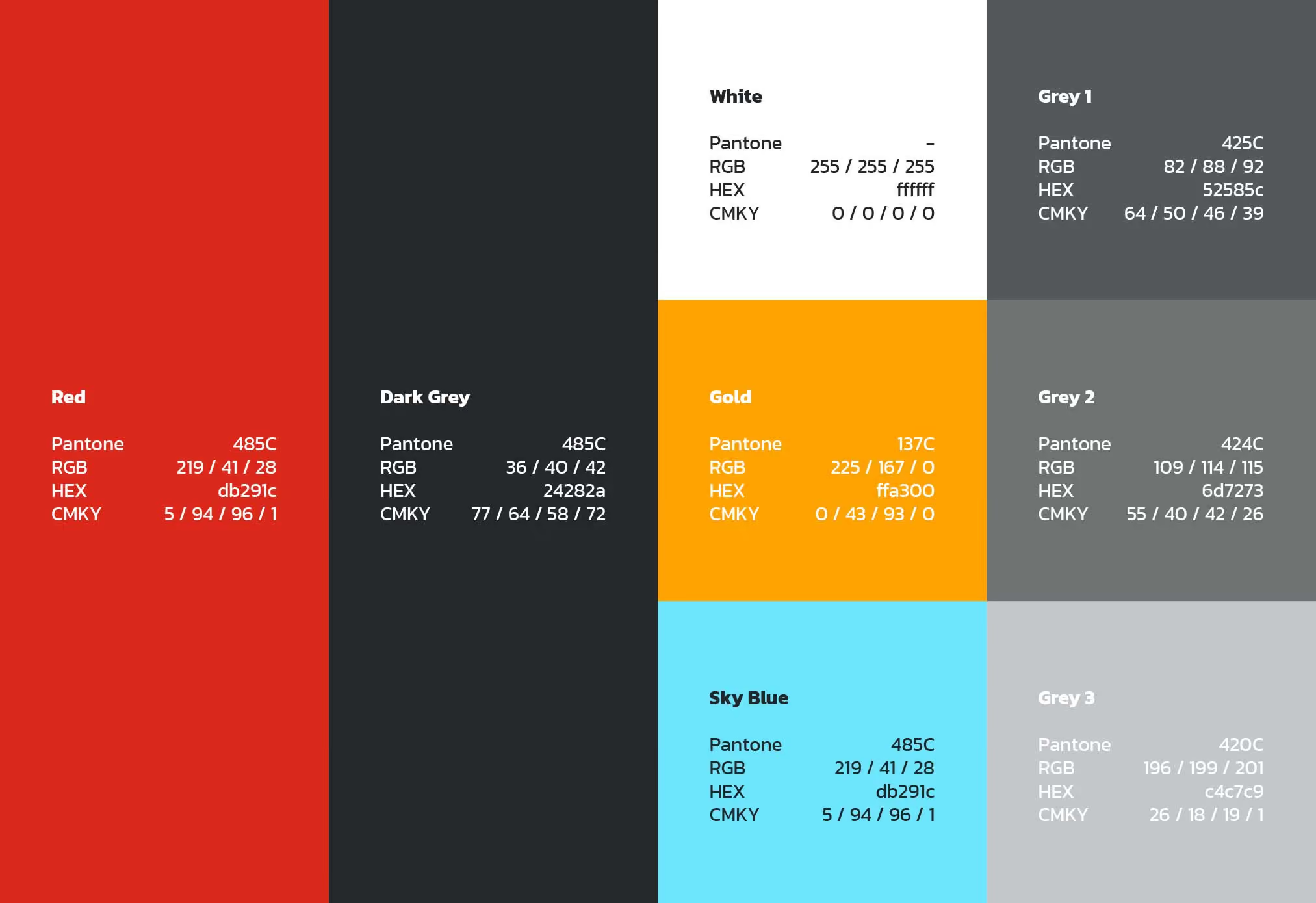
With a brand whose logo is primarily displayed on long, thin products, a wide logo was necessary. I applied a slant to indicate the speed of an arrow. The client specified a desire for red and black for the brand colours. Red is a meaningful colour in china symbolising luck and prosperity. I added a yellow/orange and blue to reference the colours of a target. I have since gone on to create further designs for Youyi including print design and graphics for their products.

